PHILADELPHIA FREEDOM
[ SPORTS BRANDING ]
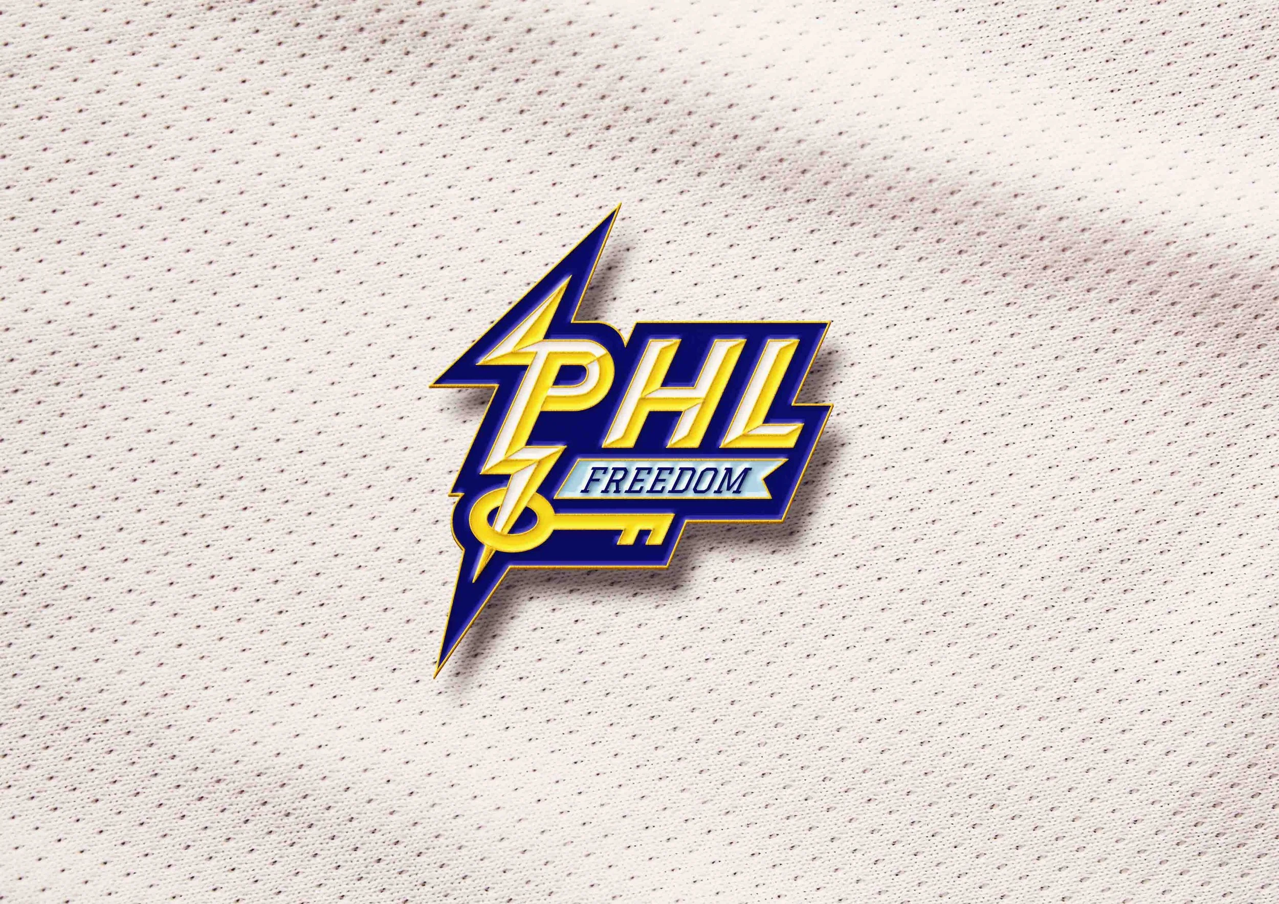
[ LOGO SYSTEMS ]
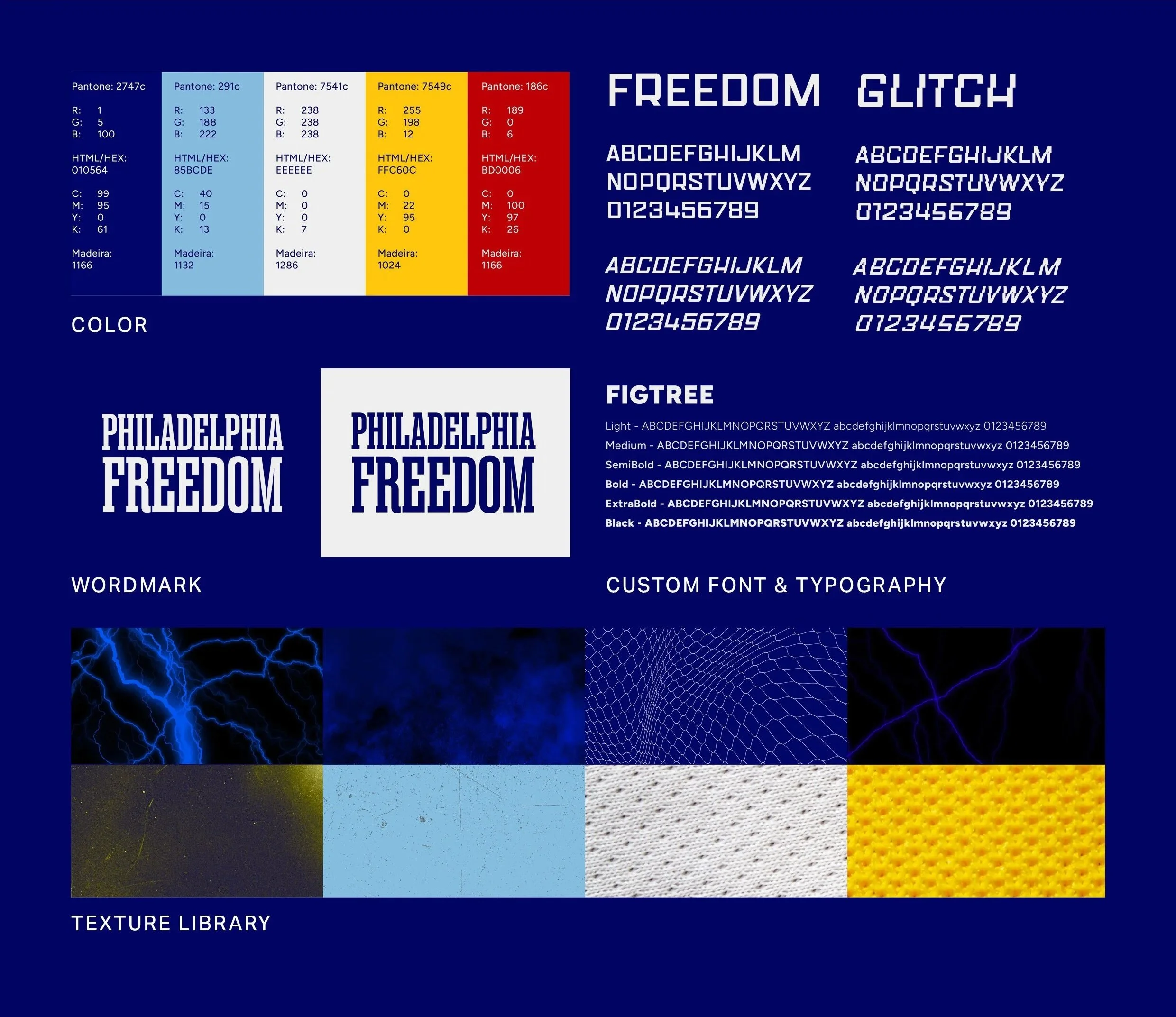
[ CUSTOM TYPOGRAPHY ]
YEAR
Fall 2025
INSTRUCTOR
Joe Bosack
Philadelphia Freedom is a speculative branding project imagining the 2030 launch of a WNBA franchise in the City of *Sisterly Love. Rooted in the city’s deep basketball history and intense sports culture, the franchise showcases how a women’s team could establish legitimacy, pride, and long-term cultural presence in a city known for passionate fandom.
The objective was to create a bold, timeless identity that reflects Philadelphia’s grit, resilience, and civic pride while supporting the growing visibility of women’s sports. The project examines how visual identity can act as a rallying symbol, helping build emotional connection, fan culture, and momentum around a new women’s franchise from day one.
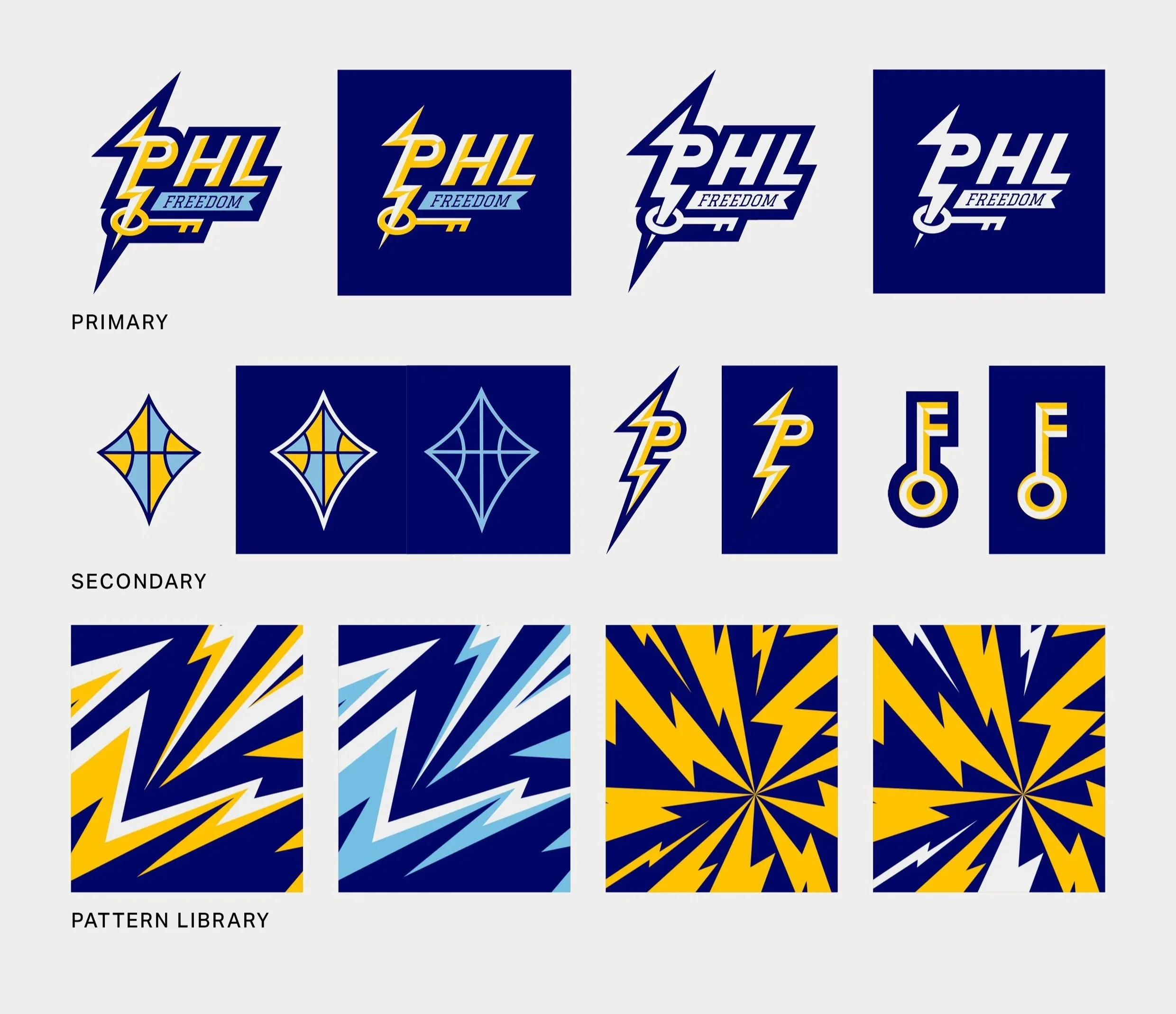
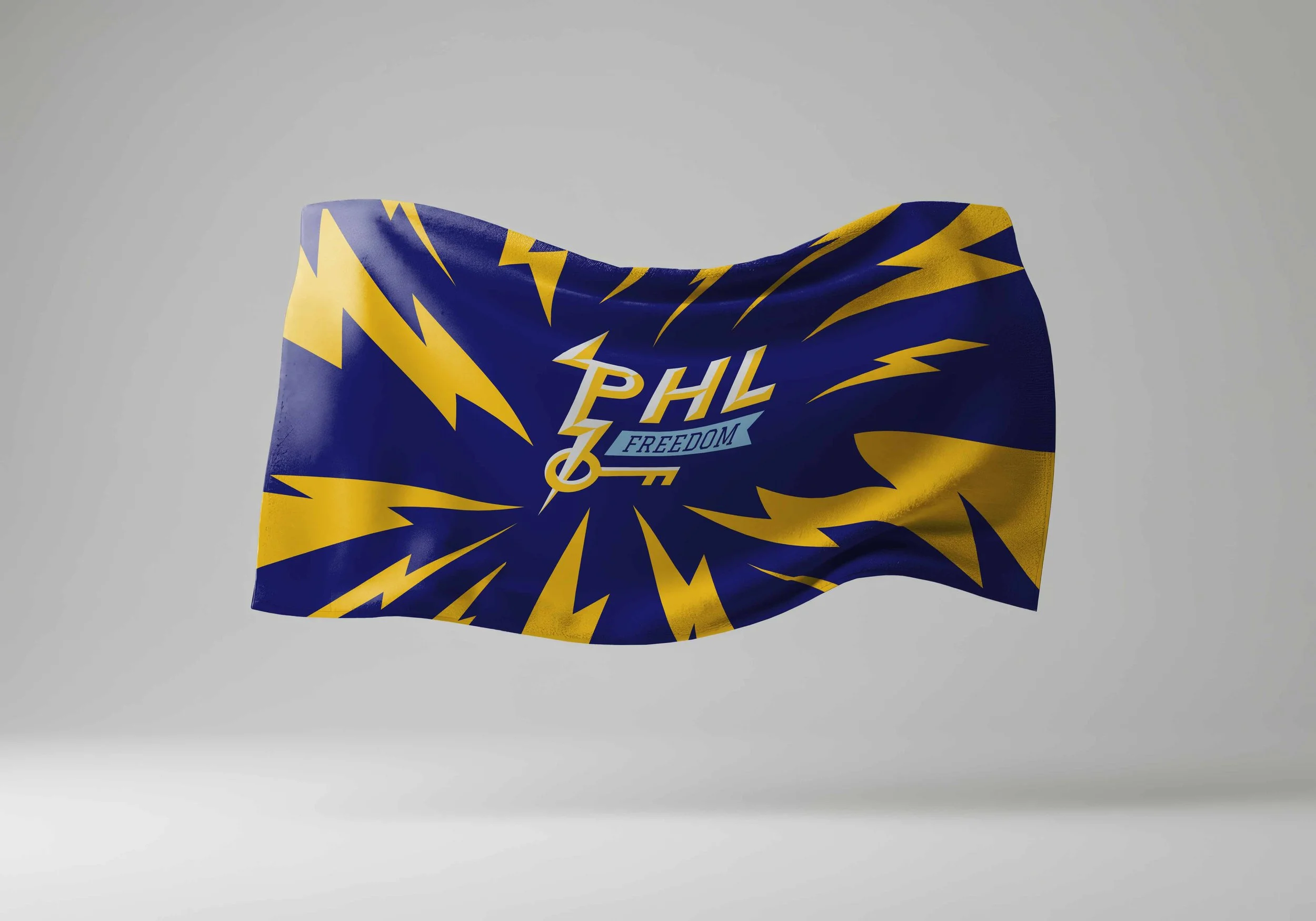
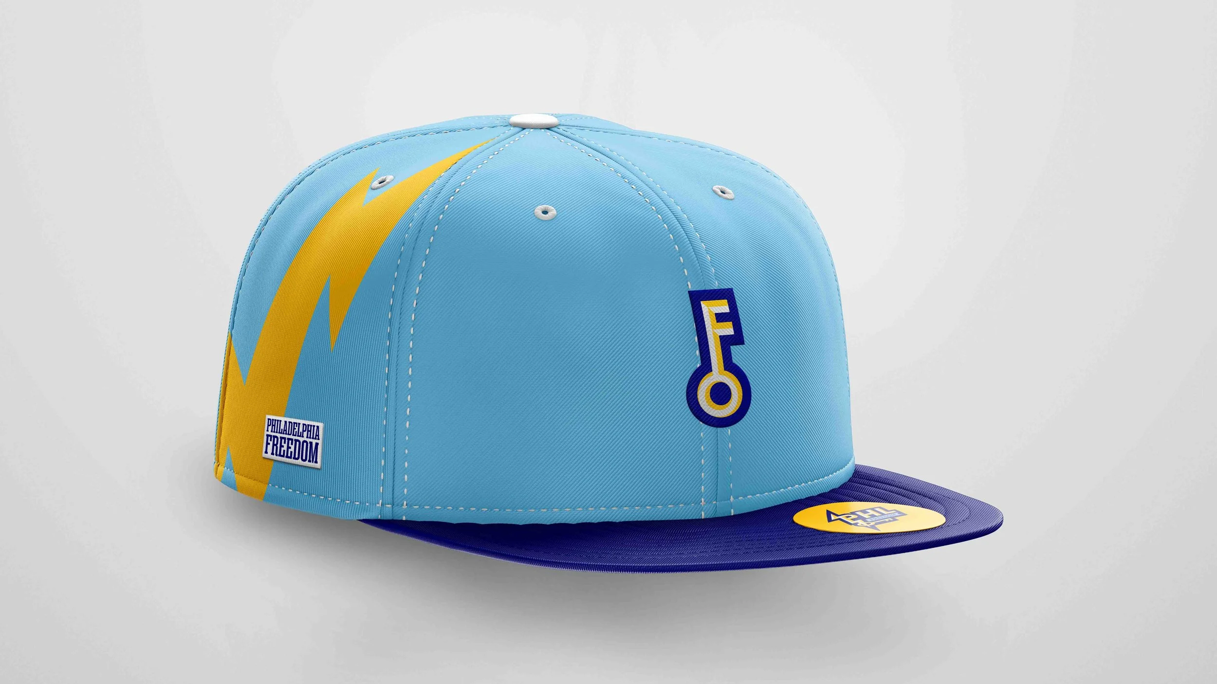
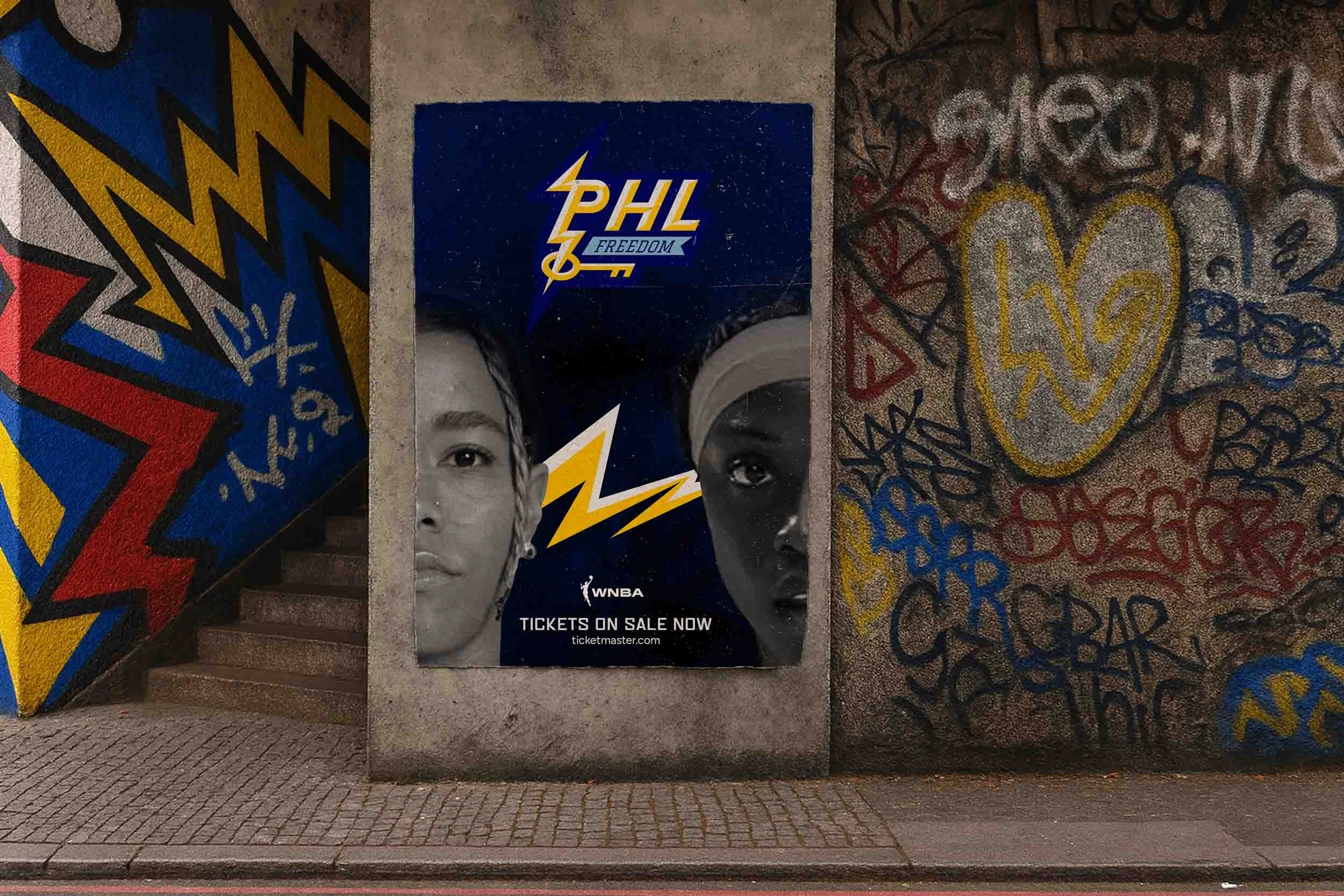
processThe process began with a visual audit of the WNBA and NBA landscapes, focusing on modern franchise rebrands, expansion brands and the gritty legacy of Philadelphia’s existing sports franchises. This research aimed to identify what feels "inherently Philly" beyond the usual landmarks. Extensive sketching led to a conceptual breakthrough centered on Benjamin Franklin’s kite and key experiment. Rather than a literal historical tribute, the identity focuses on the raw electricity and daring spirit Franklin felt when he decided to chase lightning. This resulted in a brand system rooted in the lightning bolt, the key, and the kite, symbolizing the high-voltage energy and inventive spark that defines the city.
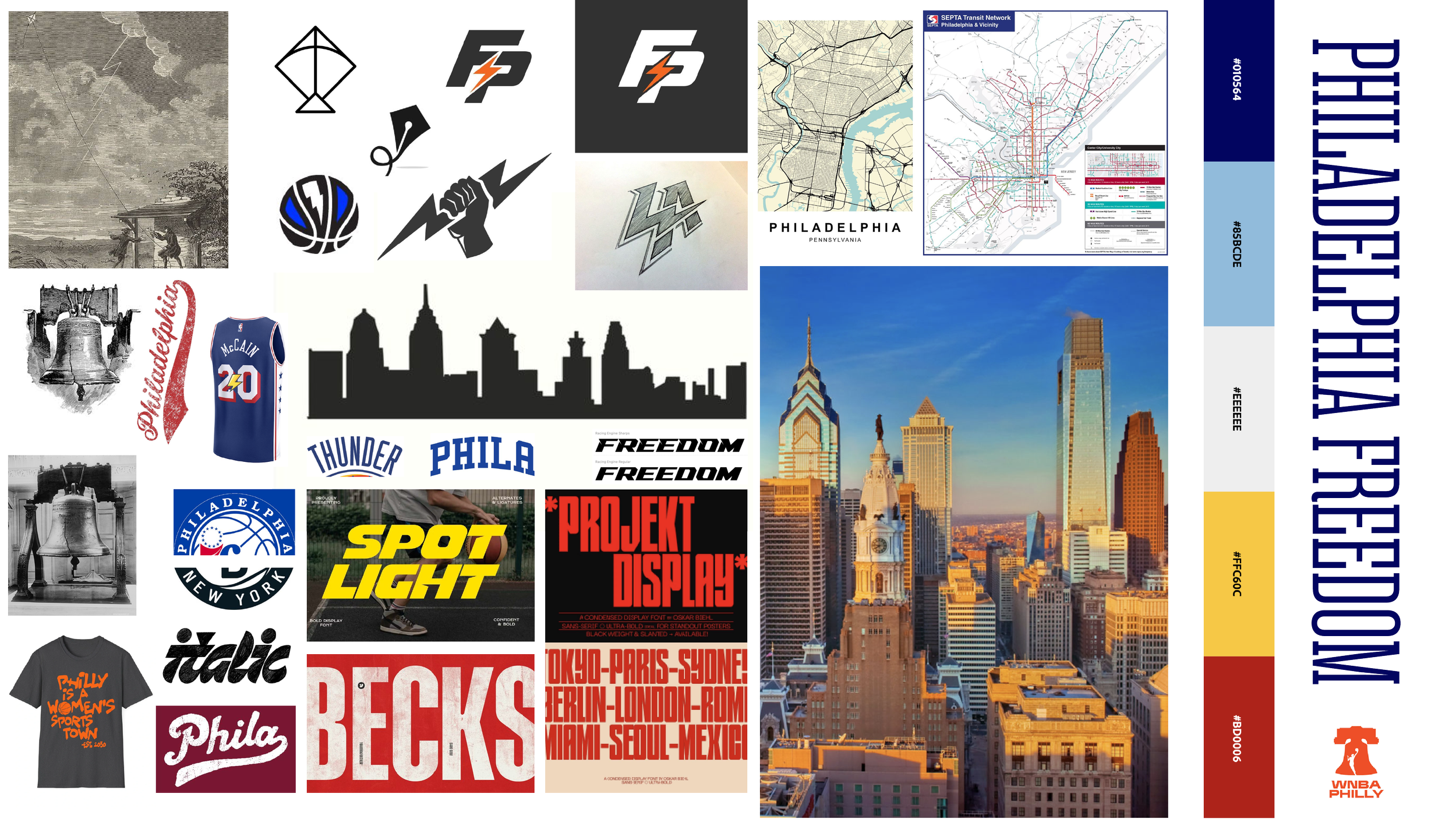
Moodboard & research
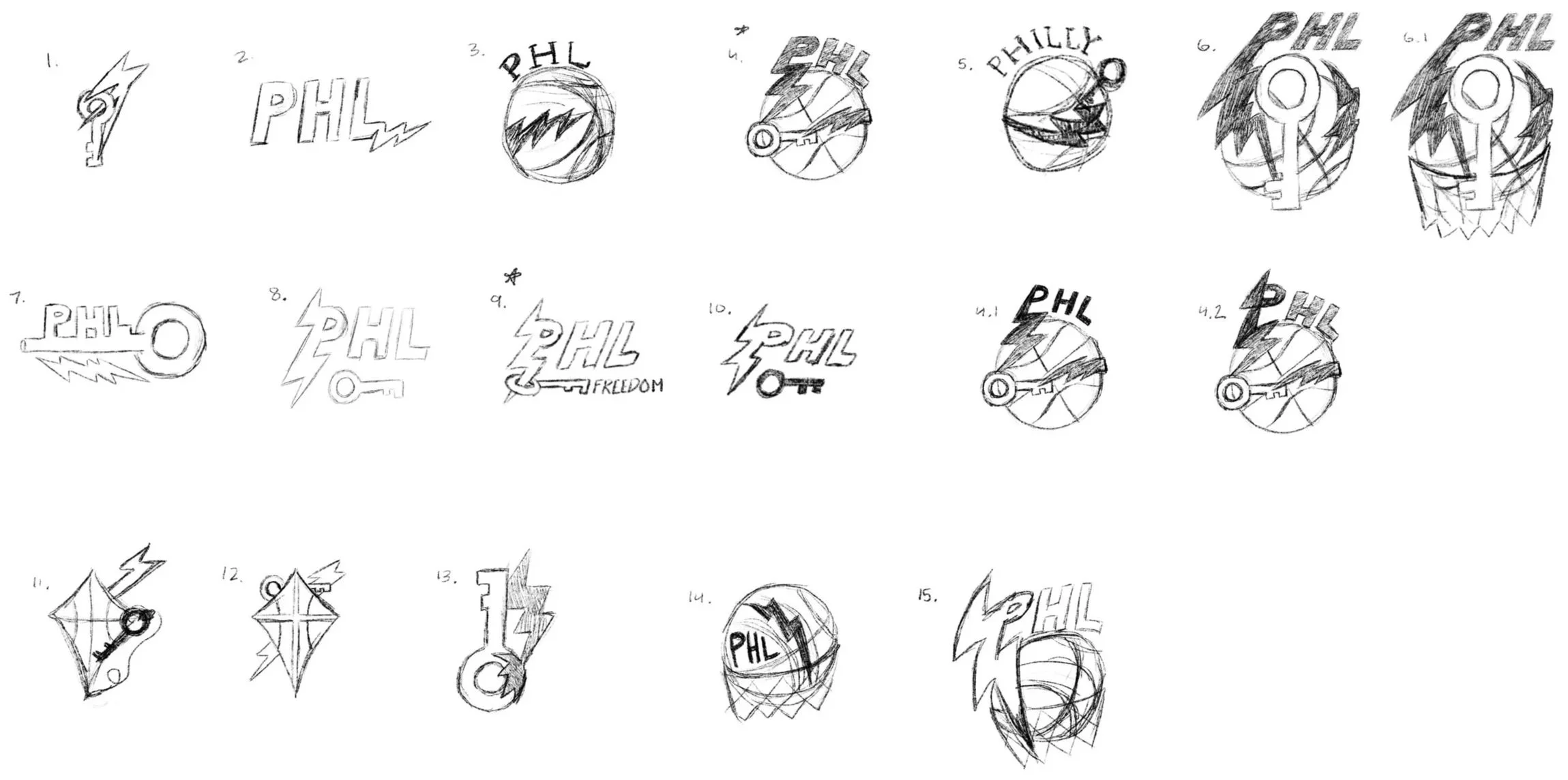
Concept Sketches
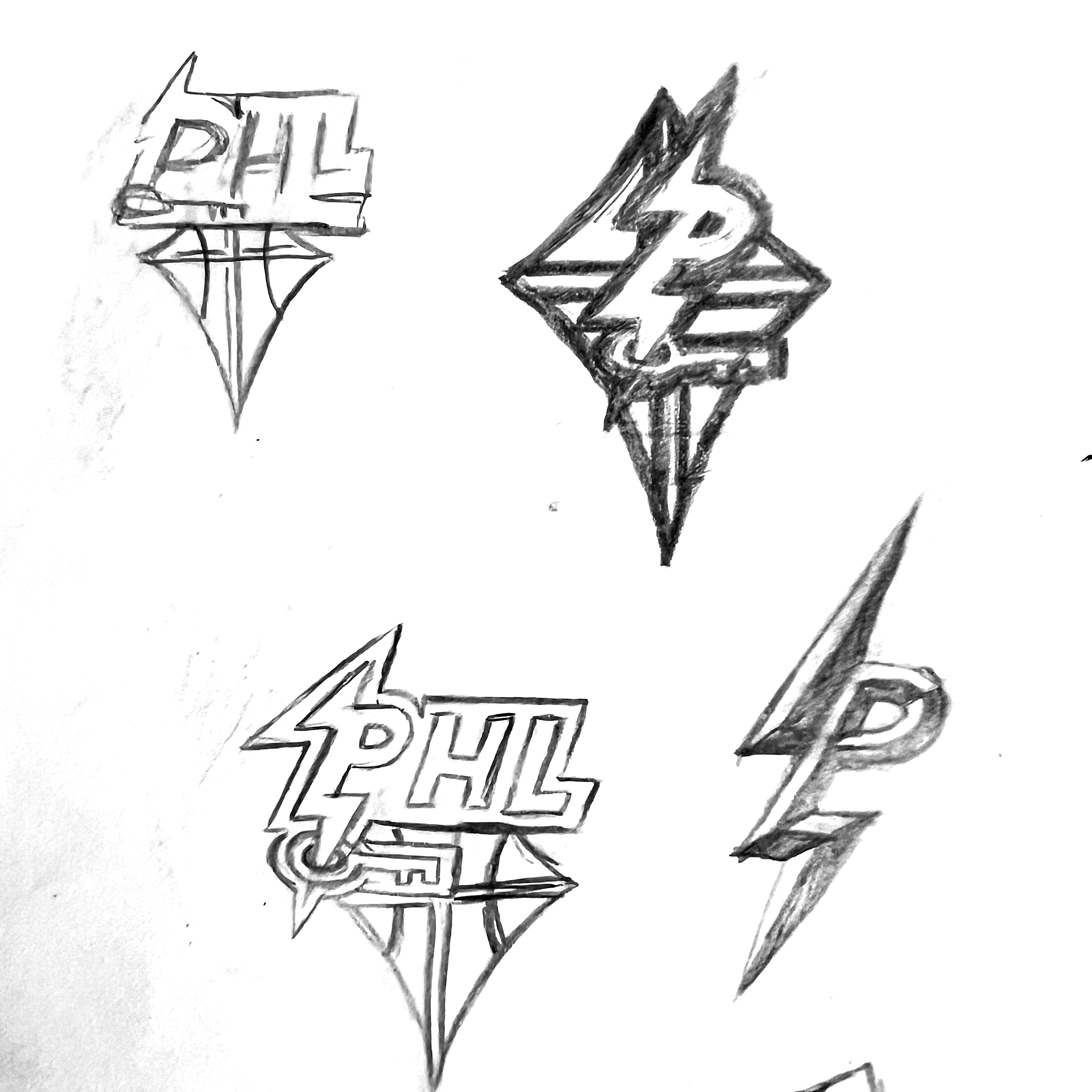
Narrowed sketches
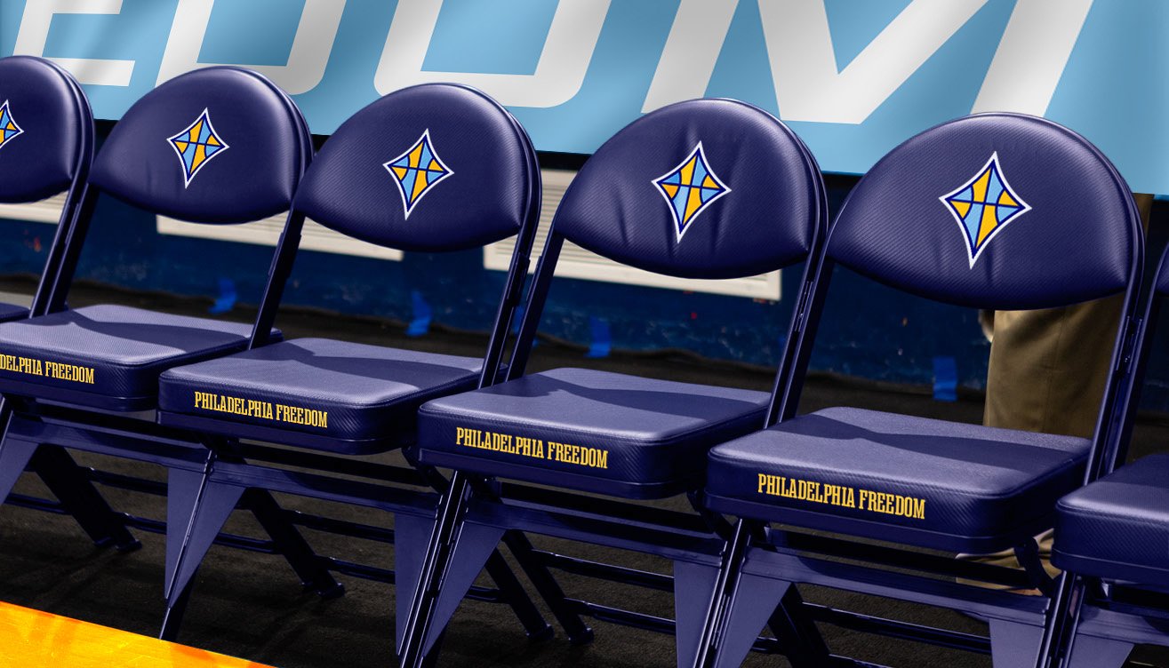
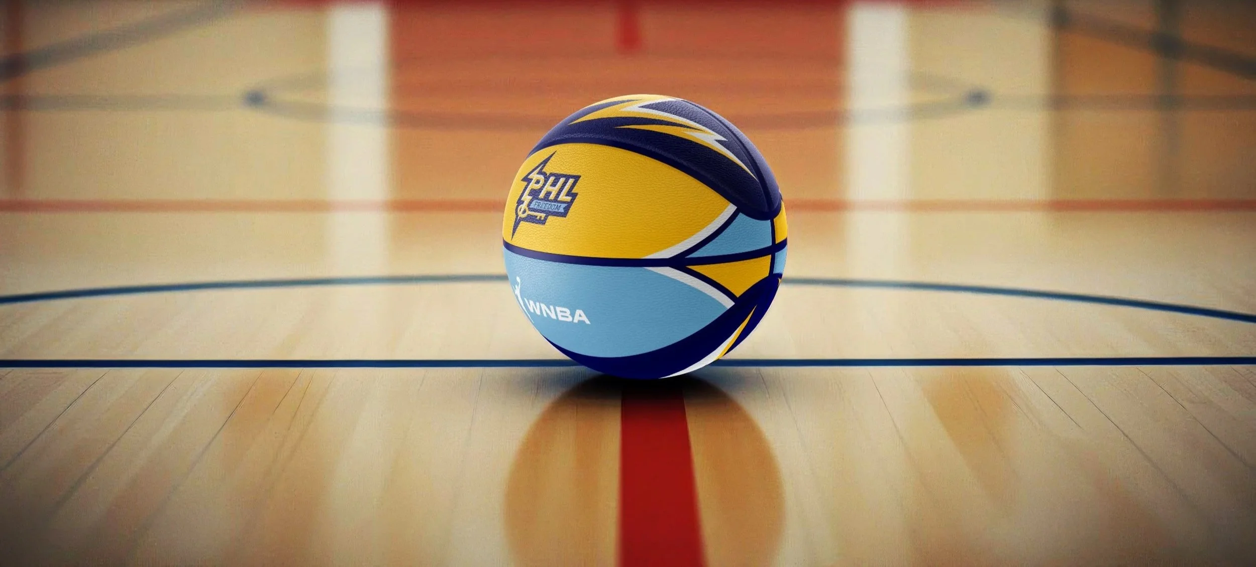
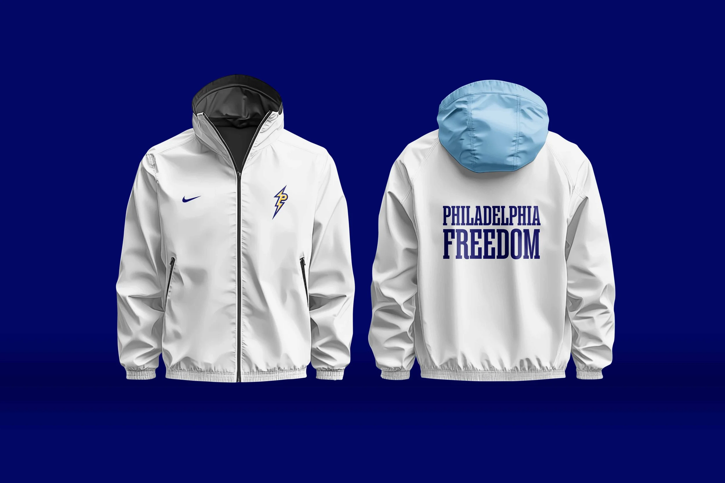
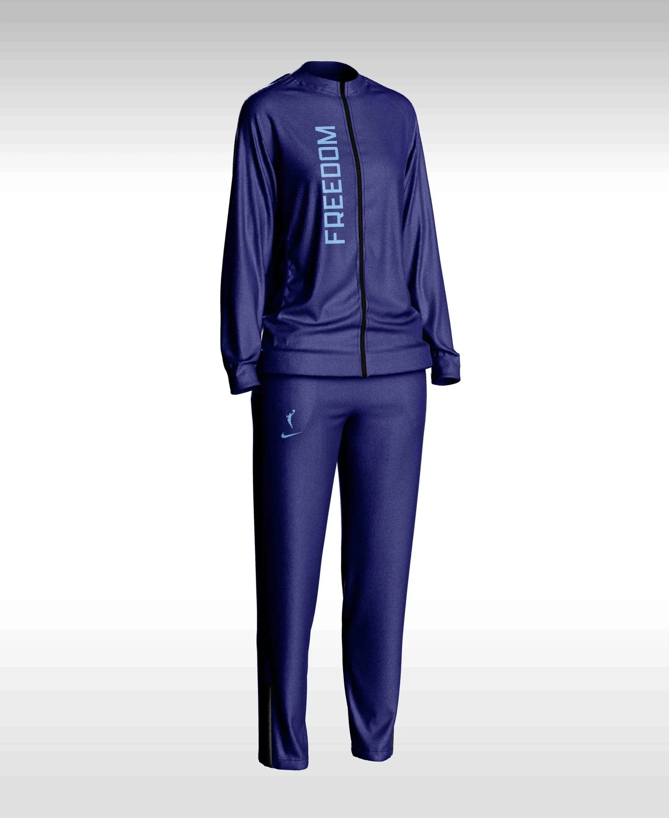
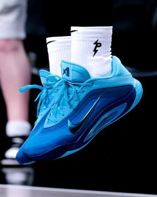
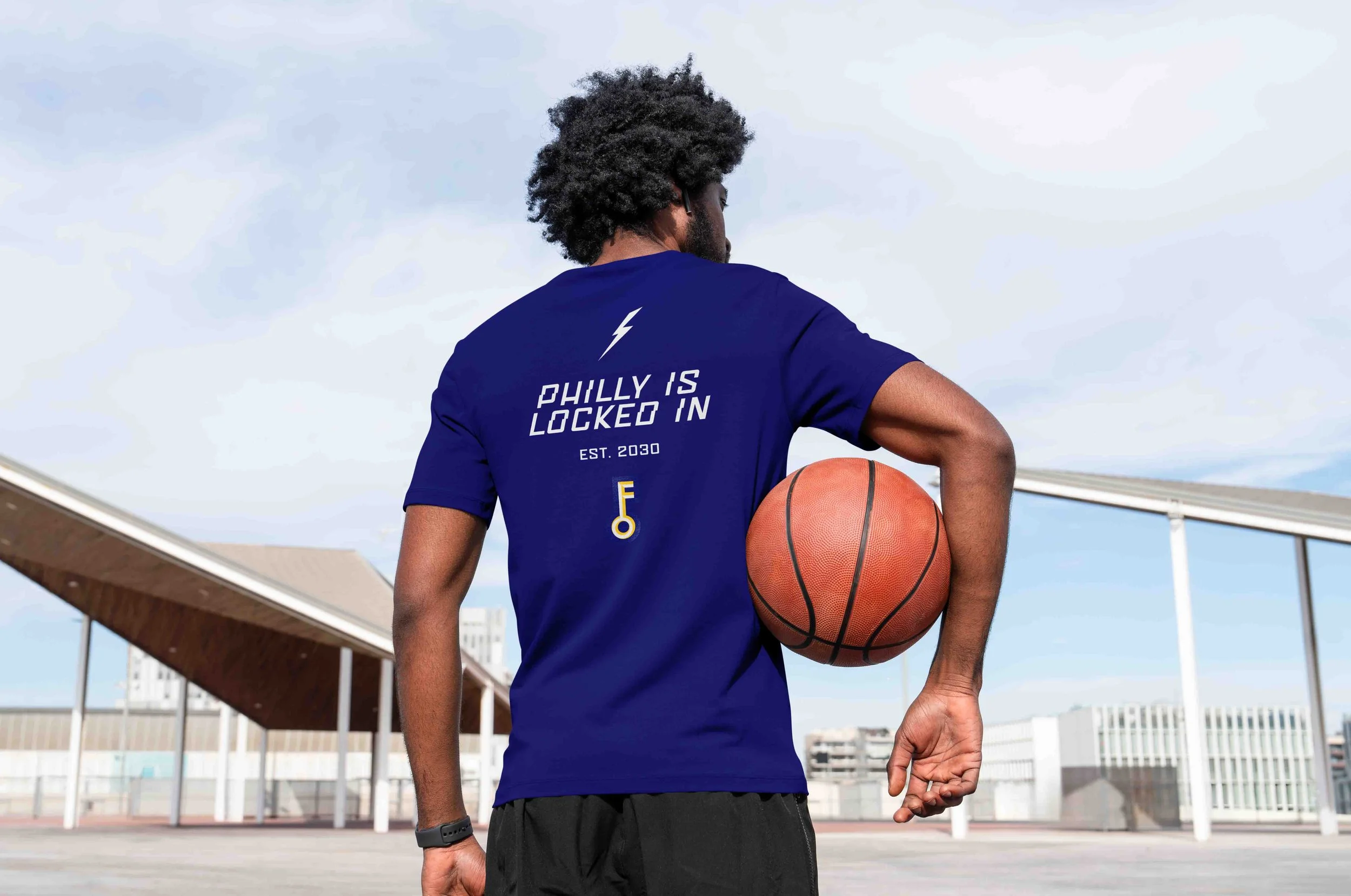
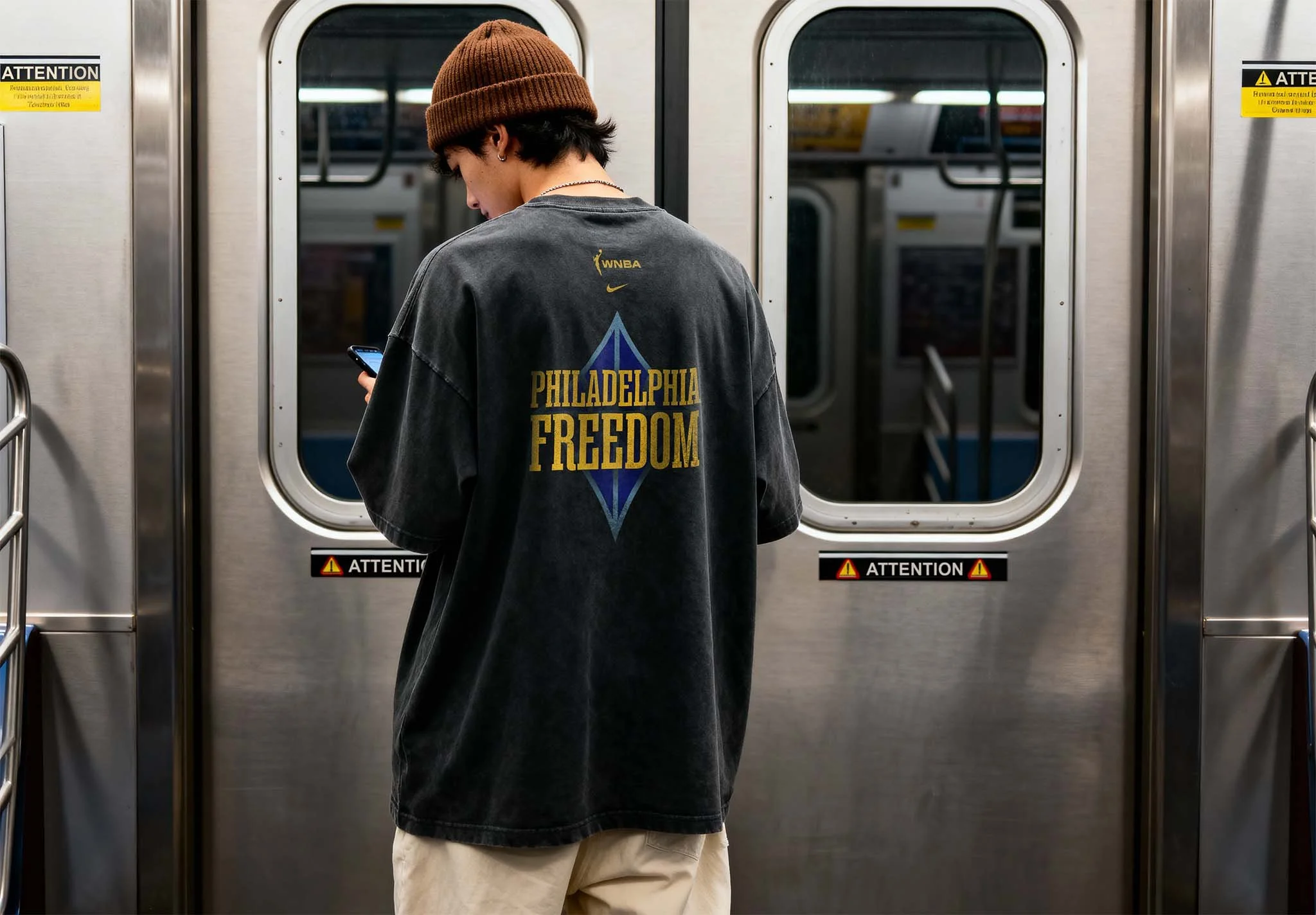
GEAR & MERCH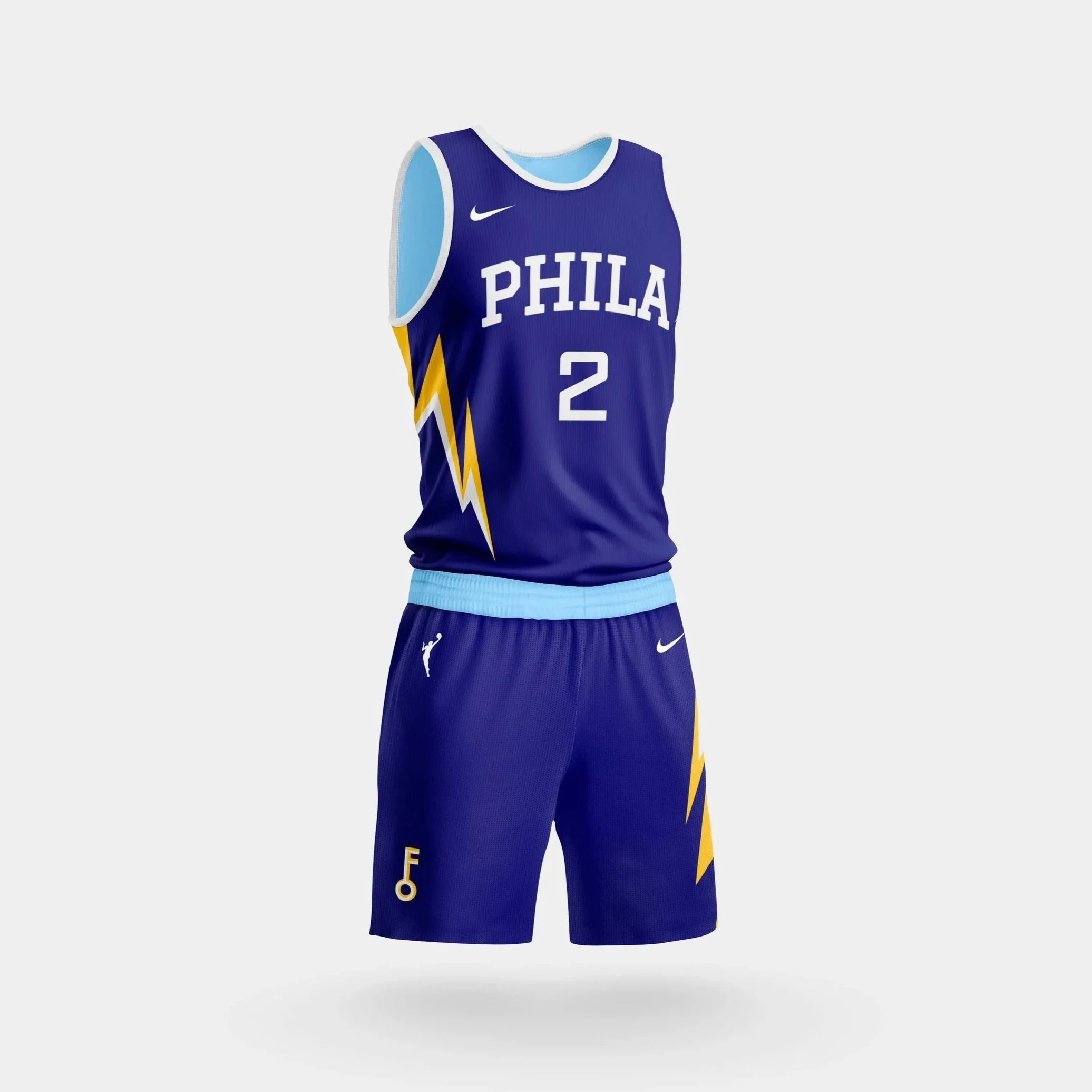

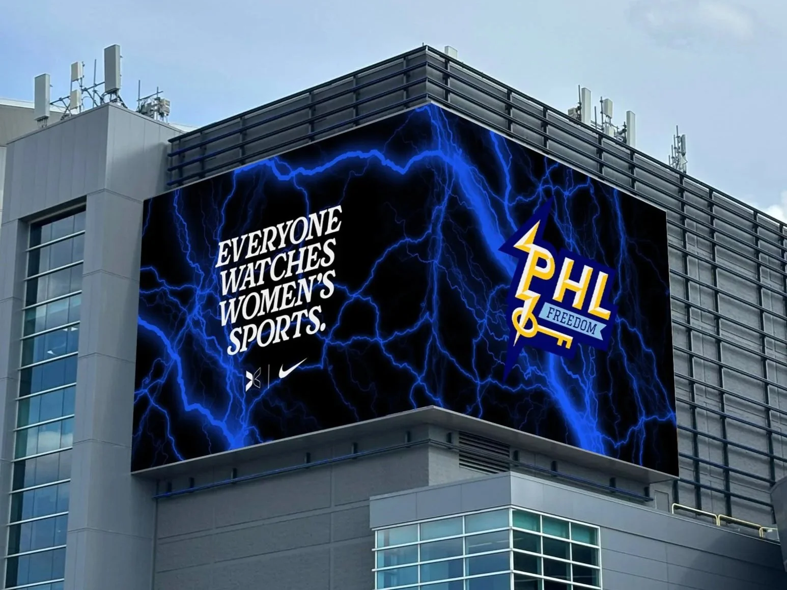
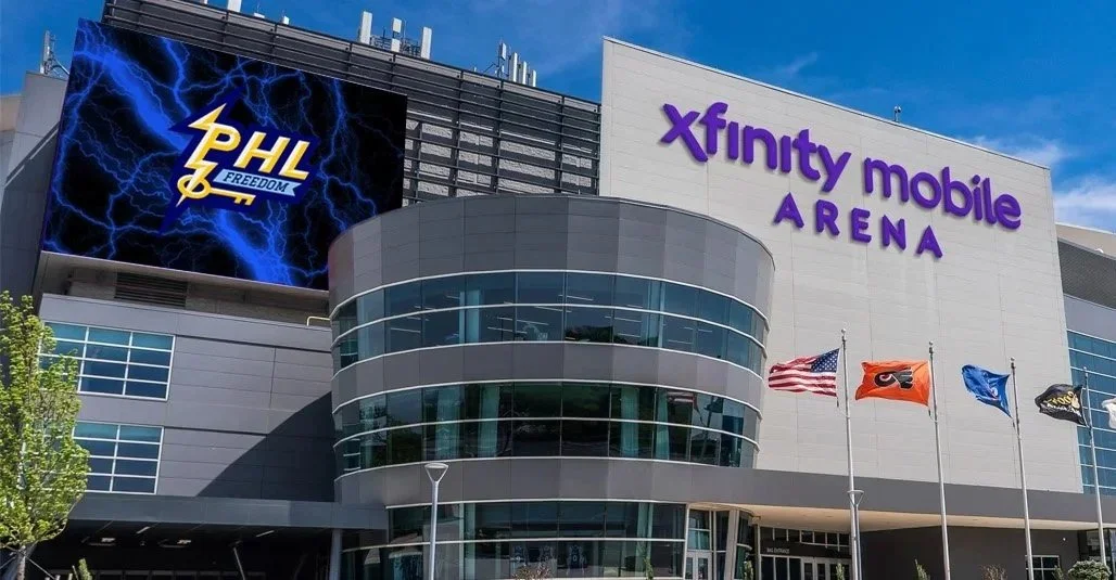
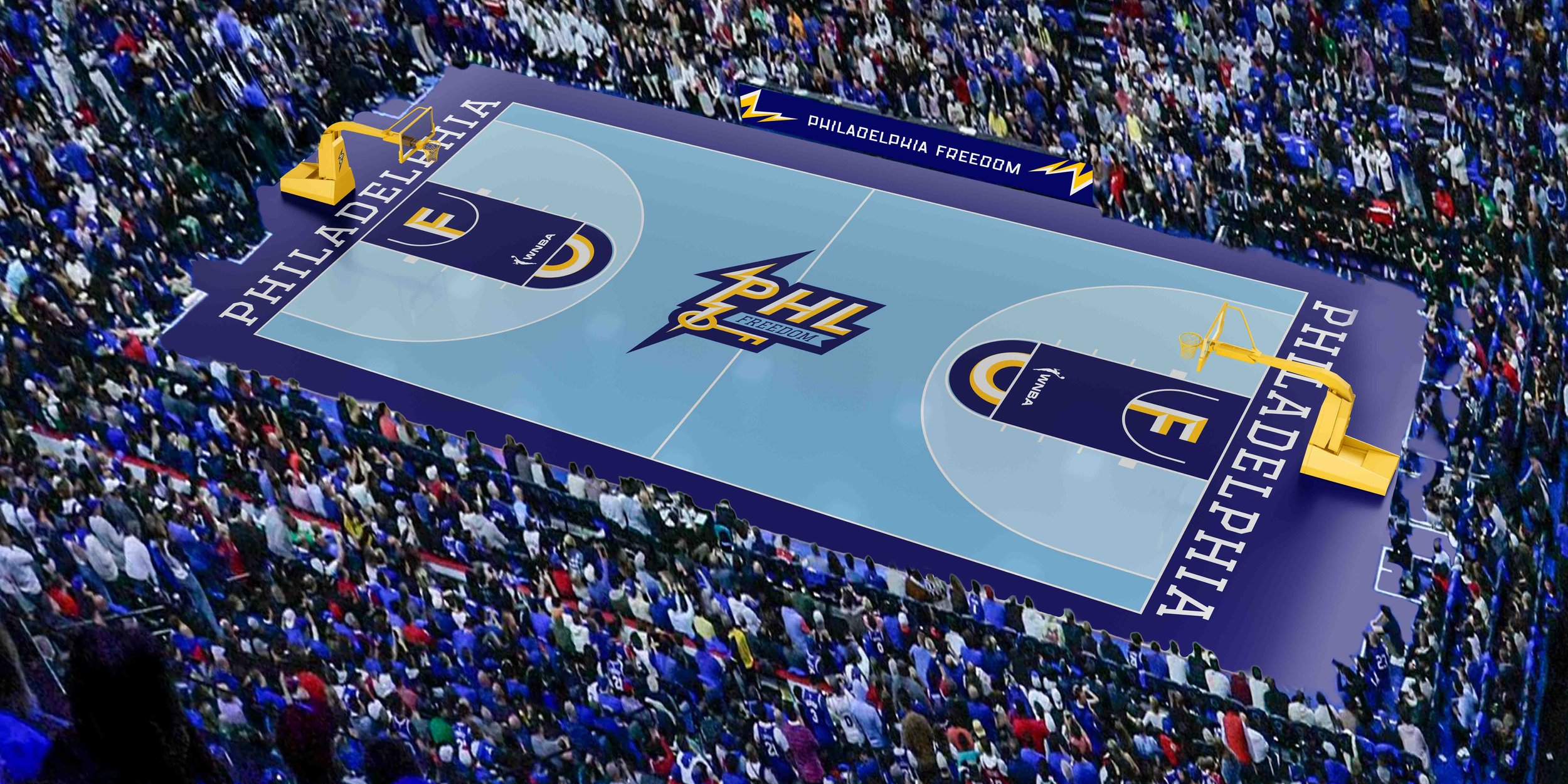
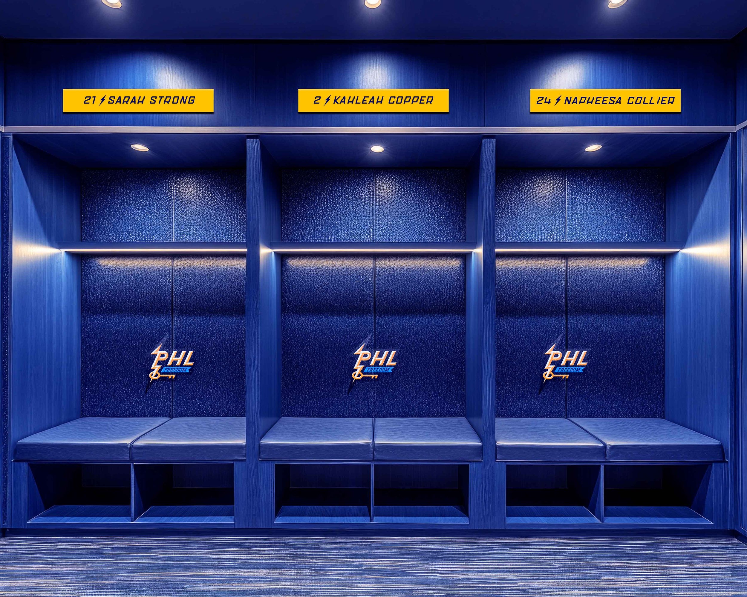
Arena &
Game Day
A key focus of this project was designing arena mockups, imagining how the identity would live in a real game-day environment. Xfinity Mobile Arena, expected to be the future home of Philadelphia’s WNBA franchise, served as the primary setting—both as a realistic context for the brand and as the arena that originally made me fall in love with live sports (RIP Wells Fargo).